Business Intelligence Dashboards and AI: A Complete Guide (2025)
AI can now create BI dashboards in minutes, but not all tools are built for accuracy. Learn the three types and how to choose one you can trust.

Over the last few years, dashboard creation just went from a months-long specialist task to something anyone can do in minutes—but not all AI tools are safe for business decisions. This guide explains what's changed, where the risks hide, and how to choose tools you can actually trust.
- From PowerBI to AI: How Dashboard Creation Is Changing
- The Three Types of AI Dashboard Tools
- The Dangers of Creating BI Dashboards with AI
- How to Build Reliable BI Dashboards with AI
- How to Evaluate AI Dashboard Tools
- The Shifts That Made AI-Native BI Possible
- Common Misconceptions About AI-Generated Dashboards
- Summary: Choosing the Right AI for your Dashboards
From PowerBI to AI: How Dashboard Creation Is Changing
For years, creating business intelligence dashboards meant hiring specialists. You needed PowerBI or Tableau experts who spent months learning complex tools, and even then, product teams waited weeks for simple dashboard updates. Smaller companies had to either pay expensive consultants or to go without proper dashboards altogether.
This bottleneck created real business costs that went beyond just frustration. When a sales team wanted to track regional performance trends, they'd submit a ticket to the data team. By the time the dashboard was ready three weeks later, the sales cycle had moved on and the insights were stale. When a product manager needed to understand user retention patterns, they'd either wait in the queue or make gut-feel decisions without data. The result was that data-driven decision making became the privilege of large companies with dedicated BI teams, while everyone else operated partially blind.
The first wave of AI tools for BI tried to fix this with natural language queries—ask a question in plain English, get an instant answer. This was genuinely useful for quick lookups. If you needed to know "what was revenue last quarter?" you could get an immediate answer instead of waiting days for someone to pull that number. But it didn't solve the dashboard problem. You still couldn't create full, organized dashboards that your team could share and use long-term. Each question was a separate interaction, and there was no way to build a cohesive view of your business that updated automatically and could be referenced repeatedly.
The second wave of AI tools now generate complete dashboards automatically. But here's where it gets tricky: the technology split into three very different approaches, and only one is actually safe for business decisions.
Example of the next wave of AI tools for BI, generating editable dashboards from data
The Three Types of AI Dashboard Tools
General AI (ChatGPT, Claude, Gemini)
What they do: Generate charts and analysis from your data using conversational AI
The problem: They predict what sounds right, not what is correct. They can hallucinate numbers, create trends that don't exist, or mix up categories—all while looking perfectly professional.
Traditional BI with AI Features (PowerBI Copilot, Tableau AI, etc)
What they do: Add AI assistants to existing enterprise BI platforms
The problem: They didn't solve the learning curve. You still need months of training to use PowerBI or Tableau effectively. The AI makes you faster, but only if you're already an expert.
AI-native BI Platforms (Annie, NarrativeBI, etc)
What they do: Built from scratch to let non-technical users create validated gtaphs, charts, or dashboards from natural language questions
How they're different: They use code-based validation—generating actual SQL or Python to calculate metrics rather than predicting plausible-sounding numbers. Every calculation is verified by their data engines before showing you the dashboard.
Here's how they compare:
| Feature | AI-native BI (Annie, NarrativeBI) |
Traditional BI (PowerBI, Tableau) |
General AI (ChatGPT, Claude) |
|---|---|---|---|
| Built for BI | ✅ Yes | ⚠️ AI add-on | ❌ No |
| Data accuracy | ✅ Validated | ✅ Yes | ❌ Manual check |
| Technical skills | ✅ None needed | ❌ BI knowledge required | ✅ None needed |
| Speed to dashboard | ✅ Minutes | ⚠️ Hours/days | ⚠️ No dashboards |
| Editable dashboard | ✅ Yes | ✅ Yes | ❌ Static only |
| Team sharing | ✅ One-click | ✅ Yes | ❌ Copy-paste |
| Learning curve | Low | High | Low |
The Dangers of Creating BI Dashboards with AI
Not all AI dashboard tools are safe for business decisions. Making decisions based on wrong data is worse than making decisions with no data at all.

These scenarios have played out at real companies, with real consequences.
Real Scenario 1: The Sales Mix-Up
A product manager asked a general AI to analyze their sales data. The dashboard showed Product Category A as the top performer. They increased inventory orders based on that insight. Three months later, after manual verification, they discovered the AI had it backwards—Category B was actually the best seller. The company was stuck with excess inventory of the wrong products and had missed the opportunity to stock what customers actually wanted.
Real Scenario 2: The Time Period Error
A VP requested a dashboard showing "quarterly revenue trends." The AI generated a beautiful line chart with steady growth—17% quarter-over-quarter increases. They presented it to the board and approved budget for ten new hires based on projected growth. During a financial audit, they discovered the AI had shown monthly data labeled as quarters. Their actual quarterly growth was roughly 6%, not 17%. The hiring plan was based on numbers that were off by nearly 3x.
Real Scenario 3: The Filter Failure
A customer success team asked for a dashboard showing "customer churn by subscription tier." The AI created a clean visualization showing that Premium tier had the lowest churn—just 3% compared to 12% for Basic. They launched an aggressive upselling campaign to move customers to Premium. Three months later, during a manual data audit, they discovered the AI had excluded cancelled Premium accounts from the calculation but included cancelled accounts in other tiers. Premium churn was actually 15%—the highest of any tier. Their entire upselling strategy was based on inverted data.
These aren't edge cases or theoretical problems. They happen because of how general AI systems work fundamentally.
Why Generalist AI Fails at BI and Dashboards
General AI tools like ChatGPT and Claude weren't built for data accuracy. They excel at writing and conversation because they predict what sounds right based on patterns. For text, this works brilliantly. For numbers, it's extremely dangerous. They don't have a built-in concept of truth for calculations—they generate numbers that look plausible, not numbers derived from your actual data.
Think about how these systems work: they're trained on billions of text examples to understand patterns in language. When you ask them to write an email or explain a concept, they draw on those patterns to produce coherent, helpful text. But when you ask them to calculate "average order value by customer segment," they're not actually querying your database and running mathematical operations. They're predicting what a plausible answer might look like based on similar-looking questions they've seen before.
The worst part? Everything looks professional and reasonable, so you trust it. The charts are polished, the formatting is clean, and the insights sound sensible. There's no obvious sign that the AI confused your date ranges or applied the wrong filter logic. You only discover the problem later—often after making significant business decisions.
What Makes AI-Native BI Tools Different
Purpose-built AI-powered business intelligence platforms solve this with validation systems that work like this:
- They generate code, not predictions: When you ask for "revenue by product category," the system writes actual SQL or Python code to query your data—code that can be reviewed and tested. This is fundamentally different from predicting what the answer might look like. The system is creating executable instructions that will always produce the same result when run against your data.
- They validate before showing: Every calculation runs through checks that verify formulas are applied correctly, data ranges make sense, and aggregations use proper business logic. If you ask for "average revenue per customer" but your data has customers with zero orders, the validation catches that the average should exclude those records (or explicitly include them, depending on your business rules). These checks happen automatically before you ever see a number.
- They work with your actual data: Instead of predicting what your numbers might look like, they query your real databases, spreadsheets, or connected tools directly. When you see a chart showing $487,392 in Q3 revenue, that number came from adding up actual transaction records, not from a language model guessing what sounds reasonable for your business size.
- They provide transparency: Most purpose-built platforms let you drill down to see exactly how a number was calculated. You can view the SQL query that generated it, see which records were included or excluded, and verify the logic yourself. This traceability is impossible with general AI predictions.
The practical difference is that you still get AI-generated dashboards in seconds, but without the risk of hallucinated numbers. You get speed and accuracy, not a tradeoff between the two.
How to Build Reliable BI Dashboards with AI
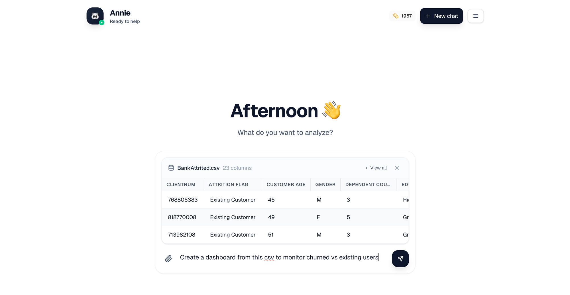
Building a dashboard with native-AI tools is straightforward and usually takes minutes rather than hours. Here's the step-by-step process (and what happens behind the hood at each step). For the purpose of this tutorial with explanation we will be using Annie.
Step 1: Connect Your Data
Upload a spreadsheet, connect your database, or link to tools you already use (CRM, accounting software, etc.). The AI immediately begins analyzing your data structure—understanding columns, data types, and relationships—without you needing to explain anything.
This initial analysis is more sophisticated than it might seem. The system is identifying which columns contain dates, which contain categorical data (like product names or regions), which contain numeric values, and how they all relate to each other. It recognizes common patterns like "customer_id" fields that link tables together, or "created_at" timestamps that define when records were generated. This structural understanding is what enables it to generate accurate queries later.
Step 2: Generate or Guide
You have two options:
- Auto-generate: Let the AI explore your data and create a dashboard automatically. It picks relevant metrics, appropriate visualizations, and logical organization. Perfect when you're not sure what you're looking for yet.
When you choose auto-generation, the AI looks for patterns that typically matter in business contexts. If your data includes timestamps, it'll show trends over time. If there are clear categories or segments, it'll show breakdowns by those dimensions. If there are obvious KPIs (revenue, user counts, conversion rates), it'll highlight those prominently. This exploratory approach often surfaces insights you didn't know to ask for. - Guide with prompts: Tell the AI exactly what you need: "show me monthly revenue by product category" or "I need to track customer acquisition costs." You get precisely what you asked for.
Guided generation works best when you have specific questions or requirements. You can be as specific as you want: "Show me the top 10 products by revenue in the last 90 days, broken down by customer segment, with a comparison to the previous 90 days." The AI translates this natural language request into the exact queries and visualizations needed.
Step 3: Data Validation Happens Behind the Scenes
While your dashboard is being created, validation systems run automatically:
- Formulas are checked for accuracy
- Data ranges are verified
- Aggregations are tested against business logic rules
- Calculations are confirmed against your actual data
This is what separates AI-native BI tools from general AI that might hallucinate numbers. The validation layer catches common errors: date ranges that extend beyond your available data, divisions by zero, aggregations that double-count records, or filters that accidentally exclude relevant data. These checks add only a few seconds to processing time but eliminate entire categories of errors.
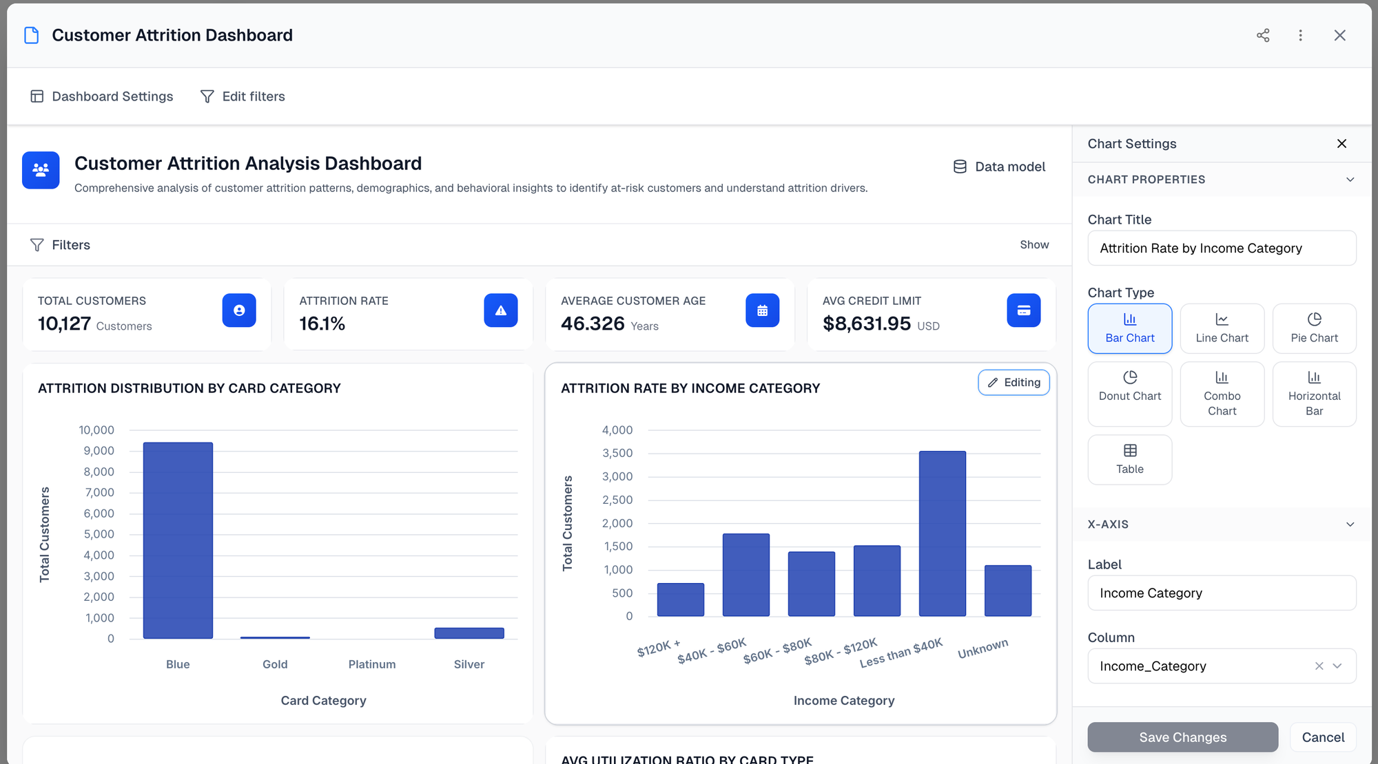
Step 4: Customize and Share
Once your dashboard appears, you can use it immediately or customize it further. Change chart types, add metrics, adjust date ranges—all without starting over. Because this is a real dashboard (not a one-time answer), you can share it with your team and it updates automatically as your data changes.
The editing experience typically works in natural language too. You can say "change this to a bar chart" or "add a filter for region" without navigating through menus or learning new interfaces. And because the dashboard is connected to your live data sources, when you add new records to your spreadsheet or database, the dashboard reflects those changes the next time someone opens it—no manual refresh needed.
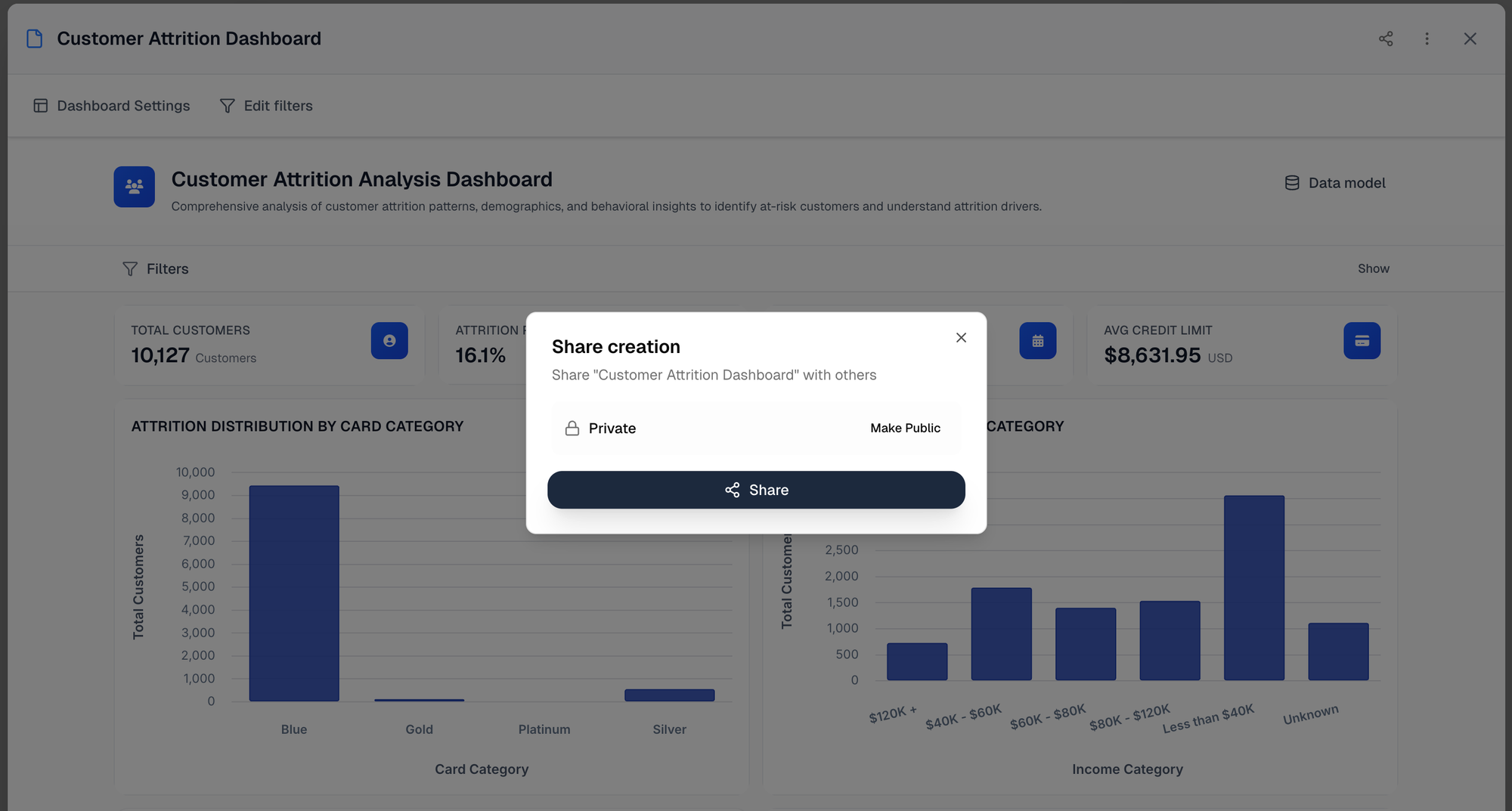
Sharing is usually as simple as clicking a "Share" button and choosing whether recipients can view, comment, or edit. The dashboard lives at a URL that you can send to anyone who needs access. Unlike static reports, everyone always sees the most current version of the data, and you never have to worry about someone making decisions based on an outdated PDF attachment.
The entire process—from connecting data to sharing a live dashboard—can happen in under ten minutes.
How to Evaluate AI Dashboard Tools
If you're considering AI-powered BI tools, here are the critical questions to ask:
1. How Does It Validate Data?
What to ask: "Does the tool generate code (SQL/Python) to calculate metrics, or does it use language model predictions?"
Why it matters: Code-based approaches can be tested and verified. Language model predictions cannot.
How to test this: Ask the vendor to show you how a specific calculation is performed. Can they show you the actual SQL query or Python code that generates a metric? If they can't or won't show you the underlying logic, that's a red flag. The best platforms make this transparency a feature, letting you view and even export the code behind any visualization.
2. Can Non-Technical Users Actually Use It?
What to test: Have someone without BI experience try to create a dashboard. Time how long it takes and how many concepts they need to learn.
Why it matters: Tools that claim to be "easy" often still require understanding of data modeling, DAX, or other technical concepts.
Watch for these warning signs: If the person needs to understand terms like "measures," "dimensions," "joins," or "aggregations" before they can create anything useful, the tool isn't truly accessible. If they have to watch hours of training videos to get started, it's not as simple as advertised. A truly accessible tool should let someone create a meaningful dashboard within 15 minutes of first seeing it.
3. What Happens to the Dashboard After Creation?
What to ask: "Can I edit this dashboard later? Can my team access it? Does it update when data changes?"
Why it matters: One-off charts aren't dashboards. Real dashboards need to be living tools your team uses repeatedly.
Test the full lifecycle: Create a dashboard, share it with a colleague, then update your underlying data. Does the dashboard refresh automatically? Can your colleague make their own edits without breaking your version? Can you roll back to previous versions if needed? These capabilities separate real dashboard platforms from tools that just generate static visualizations.
4. How Transparent Is the Calculation Logic?
What to ask: "Can I see how this number was calculated? Can I verify the formula?"
Why it matters: If you can't understand where numbers come from, you can't trust them for important decisions.
Look for audit trails: The platform should show you not just the final number, but the steps taken to get there. Which records were included? What filters were applied? How were nulls or edge cases handled? This level of transparency lets you catch errors before they become business problems.
5. What's the Real Cost Structure?
What to ask: "Beyond the base price, what costs scale as we grow? What features are locked behind higher tiers?"
Why it matters: Many BI tools have hidden costs that emerge as your usage grows—per-user fees, data volume charges, or essential features restricted to enterprise plans.
Calculate total cost of ownership: Factor in not just software licensing, but also training time, ongoing support needs, and the cost of any specialists you'll need to hire. A tool that costs more upfront but requires zero training might be cheaper than a "free" tool that requires a full-time BI analyst to maintain.
The Shifts That Made AI-Native BI Possible
Three technological shifts converged recently to make purpose-built AI BI platforms viable:
Large language models reached production quality for code generation in 2023-2024. Earlier LLMs couldn't reliably write correct SQL or Python. Now they can generate validated queries consistently.
The breakthrough wasn't just that LLMs got better at writing code—it's that they got reliable enough to use in production without constant human oversight. Early versions might produce correct SQL 60-70% of the time, which sounds impressive but is unusable in practice (would you trust a calculator that works 60% of the time?). Current models achieve 95%+ accuracy on well-structured data problems, and when combined with validation layers, that becomes reliable enough for business decisions.
Browser-based data processing matured. Modern web technologies can now handle complex data operations that previously required desktop software, making these tools accessible anywhere without installation.
Five years ago, processing a dataset with millions of rows required downloading software and running it on your local machine. Your browser simply couldn't handle that much computation. Advances in WebAssembly, web workers, and cloud computing architectures changed that. Now the heavy processing happens on powerful servers, while your browser becomes a sophisticated interface that can handle real-time interactions with large datasets. This means you can access your dashboards from anywhere—your laptop, your phone, a tablet—without sacrificing performance.
Validation frameworks caught up. The ability to automatically check AI-generated code for correctness—and do it fast enough that users don't notice the delay—only became reliable in the past 18 months.
The technical challenge here was creating validation that runs in milliseconds, not seconds. When an AI generates a SQL query, the validation system needs to check it for common errors (syntax mistakes, logic flaws, security vulnerabilities) before executing it against your data. Early attempts at automated validation were either too slow (adding 10-20 seconds per query) or too limited (catching only obvious syntax errors). Recent advances in static analysis and symbolic execution made it possible to validate complex queries in under a second while catching subtle logical errors.
This isn't incremental improvement over what came before. It's the first time all three pieces (conversational AI + data accuracy + accessibility) existed together in one solution: AI-native BI platform. Each piece had to reach a certain threshold of capability before the whole system became viable, and they all crossed that threshold within about 18 months of each other.
Common Misconceptions About AI-Generated Dashboards
As this technology becomes more mainstream, several myths have emerged that are worth addressing:
"AI dashboards are just for small businesses with simple data"
The reality: Purpose-built AI BI platforms scale to enterprise complexity. They can handle multiple data sources, complex joins, intricate business logic, and millions of rows of data. The difference is that they make that complexity accessible without requiring specialists. Large companies use these tools alongside traditional BI platforms—AI for rapid exploration and iteration, traditional BI for highly customized executive reporting.
"If it's automated, I can't customize it"
The reality: AI-generated dashboards are starting points, not final products. The best platforms let you edit everything—change visualizations, adjust calculations, add custom metrics, modify layouts. The AI handles the heavy lifting of initial creation, but you maintain full control over the result. Think of it like using a template in PowerPoint: it gets you 80% of the way there quickly, but you can customize that last 20% however you need.
"My data is too messy for AI to understand"
The reality: Real-world data is always messy, and purpose-built platforms are designed with that in mind. They handle common data quality issues: missing values, inconsistent formatting, duplicate records, unusual column names. They ask clarifying questions when they encounter ambiguity. And because they generate code you can review, you can see exactly how they're handling edge cases and adjust if needed. Messy data is a challenge for any BI tool, not a unique limitation of AI-powered ones.
"I'll lose my job if we automate dashboard creation"
The reality for BI professionals: AI hasn't eliminated the need for BI experts—it's changed what they focus on. Instead of spending 80% of their time on routine dashboard requests, analysts now spend time on strategic questions: defining what metrics actually matter, designing data architectures, investigating complex anomalies, and helping teams interpret insights. The demand for data expertise has increased, not decreased, because making dashboards accessible means more people are asking sophisticated questions.
"AI will make mistakes I won't catch"
The reality: This concern is valid for general AI tools but inverted for purpose-built platforms. With traditional manual dashboard creation, human errors (wrong formulas, misaligned data ranges, copy-paste mistakes) are common and often invisible. Purpose-built AI platforms with validation catch many errors that humans would miss. The key is choosing tools with strong validation—not avoiding AI altogether.
Summary: Choosing the Right AI for your Dashboards
Dashboard creation is finally breaking free from the specialist bottleneck. The transformation isn't just about speed—it's about who can create reliable dashboards and how they do it.
General AI tools create a dangerous trap. They're easy to use and produce professional-looking results, making them tempting. But they predict what sounds right rather than guarantee what is correct, leading to hallucinated data in charts that look perfectly legitimate. The risk isn't that they sometimes get things wrong—it's that they get things wrong in ways that are nearly impossible to detect without manually verifying every number.
Traditional BI tools with AI features still require specialists. Adding conversational AI to PowerBI or Tableau makes experts faster, but doesn't help teams without existing BI knowledge. These tools have made incremental improvements, but they haven't solved the fundamental accessibility problem. If your company already has BI expertise and infrastructure, the AI features add value. If you're starting from scratch or trying to empower non-technical teams, they're not the answer.
AI-native BI platforms finally deliver on the original promise: anyone can create reliable dashboards without technical knowledge or expensive consultants. They combine conversational simplicity with validation systems that verify every number before showing it to you. This combination—ease of use plus data accuracy—is what makes the category genuinely new rather than just an iteration on existing tools.
The technology to democratize business intelligence finally exists. The critical choice is using tools built for accuracy, not just convenience. When evaluating options, focus on validation methods, genuine ease of use, and long-term dashboard utility rather than impressive demos. Ask to see the code behind the calculations. Have non-technical team members try to build something real. Test what happens when you update your data.
The next few years will likely see rapid evolution in this space. More purpose-built platforms will emerge. Traditional BI vendors will continue improving their AI capabilities. General AI tools will get better at working with data. But the fundamental principles for evaluation won't change: prioritize accuracy, accessibility, and practical utility over flashy features or brand recognition.
If you're curious to see how native-AI BI tools work in practice, we'd love to have you try Annie. Upload a spreadsheet or connect your data source and see if you can build a useful dashboard in under few minutes. No commitment, no pressure—we just think the best way to understand the difference is to experience it yourself.
That said, the category matters more than any single product. Whether you try Annie or another platform, use the evaluation criteria in this guide. The transformation in business intelligence is real, and it's worth finding the right tool for your needs.