Create a BI dashboard with PowerBI, Tableau, or Annie

This comparison examines how three BI tools approach the same task: building a monthly sales performance dashboard. By evaluating Tableau, Power BI, and Annie side by side, we reveal the practical differences in speed, complexity, and accessibility that impact how quickly teams can move from questions to insights.
- Why Dashboard Creation Speed Matters
- Creating a Monthly Sales Performance Dashboard
- Create a Dashboard with Tableau
- Create a Dashboard with Power BI
- Create a Dashboard with Annie
- Speed and Complexity Comparison
- Who Each Tool Works Best For
- The Shift Toward Faster BI
Why Dashboard Creation Speed Matters
Dashboards exist to accelerate decision-making. Their value lies not in the visuals themselves, but in how quickly they can turn questions into answers.
In fast-moving business environments, the ability to analyze data and act on insights can mean the difference between seizing an opportunity and missing it entirely. When leadership asks "How are we performing this quarter?" or "Where should we focus our resources?", the speed of the response directly impacts the quality and timing of strategic decisions.
Speed in dashboard creation matters because:
- Business moves faster than reporting cycles – Opportunities and risks don't wait for scheduled dashboard delivery
- More people need access to insights – Democratizing analytics means removing technical barriers
- Context changes rapidly – Teams need to ask new questions and get answers immediately, not days later
Two factors determine whether a BI tool enables or constrains this speed:
- Time to insight: How long from asking a question to seeing the answer?
- Required expertise: Can business users create dashboards, or only technical specialists?
This comparison examines three BI tools—Power BI, Tableau, and Annie—to understand how their approaches to dashboard creation affect speed and accessibility.
The Scenario: Building a Monthly Sales Performance Dashboard
To make the comparison concrete and fair, the same dashboard is built using all three tools. The objective is to answer a common business question faced by sales and revenue teams.
Business question: How is revenue evolving month over month, and how does performance differ across product categories and regions?
KPIs Required
- Total revenue
- Month-over-month growth
- Product category breakdown
- Regional comparison
Visuals Included
- Line chart to show monthly revenue trends
- Bar chart to compare product categories
- Summary table for regional performance
- KPI block highlighting key metrics
The dataset, KPIs, and visual requirements remain identical across Tableau, Power BI, and Annie.
Create a Dashboard with Tableau
In Tableau, building this dashboard follows a traditional BI workflow that relies heavily on manual configuration.
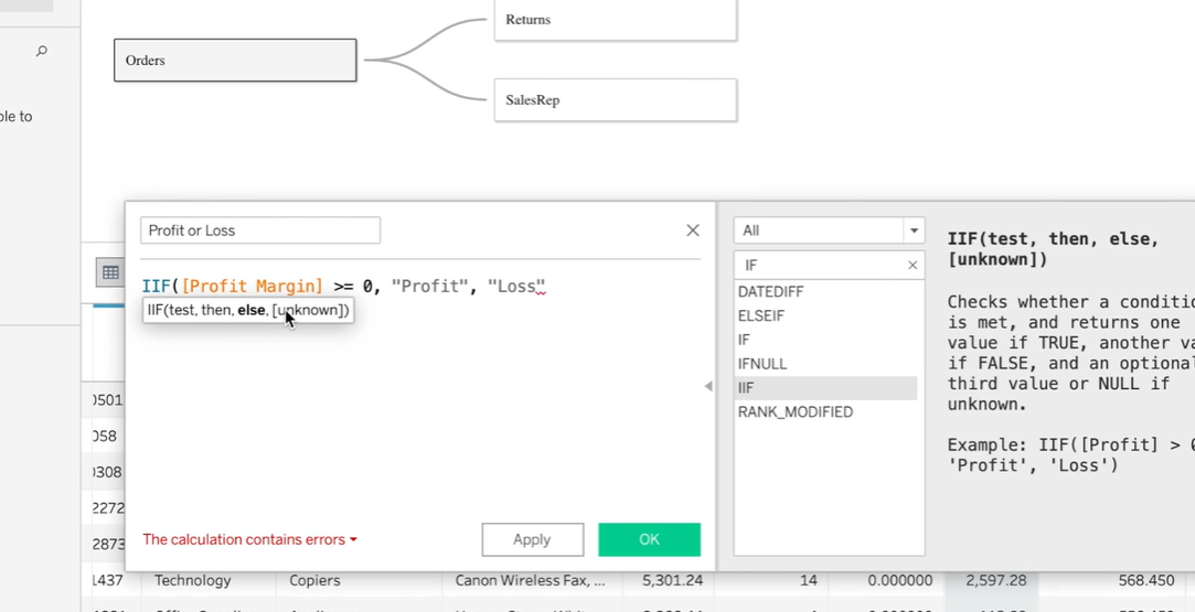
The process begins by connecting the dataset and verifying field types, particularly dates and numeric measures. Once the data is ready, calculated fields must be created to define metrics such as total revenue and month-over-month growth. These calculations require familiarity with Tableau’s formula syntax and time-based logic.
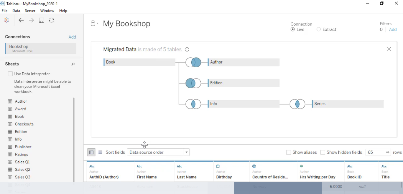
After the metrics are defined, each visual is built separately. Line charts, bar charts, tables, and KPI views are created as individual worksheets. Each worksheet requires its own configuration, including dimensions, measures, filters, and formatting choices.
The final step is assembling all worksheets into a single dashboard. This involves arranging elements, resizing containers, aligning visuals, and adjusting spacing to ensure readability and consistency.
Skills required: Advanced analytics knowledge and Tableau experience
Tableau offers strong customization and presentation capabilities, but the process depends on the user’s technical skill and familiarity with the tool.
Create a Dashboard with PowerBI
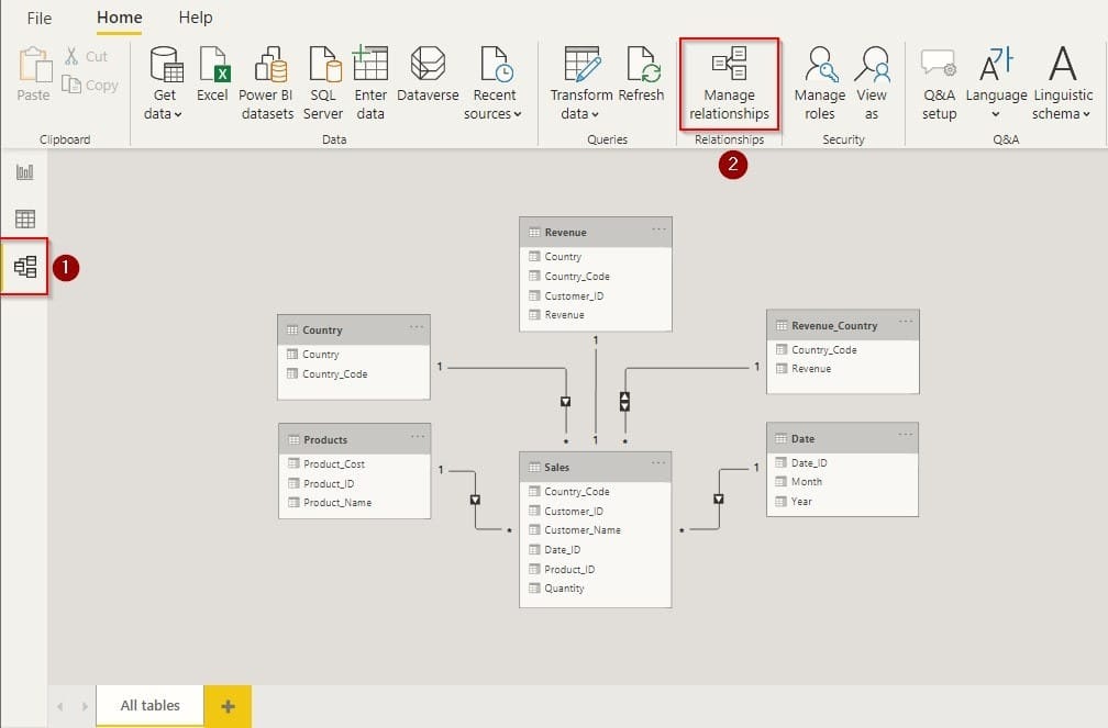
Power BI follows a similar approach, with a stronger emphasis on data modeling and calculations.
The workflow starts by importing data and defining the data model. Relationships between tables must be set correctly, and date fields often require additional configuration to support time-based analysis.
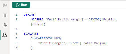
Next, DAX measures are written to calculate total revenue, month-over-month growth, and any other derived metrics. This step is critical and often time-consuming, as DAX requires a solid understanding of context, filters, and time intelligence functions.
Once measures are ready, visuals are built manually on the report canvas. Line charts, bar charts, tables, and KPI cards are added and configured individually. Filters and slicers may also be included to enable interaction.
Finally, the dashboard is formatted, reviewed, and either published to Power BI Service or exported for sharing.
Skills required: Strong proficiency in BI modeling expertise
Power BI is well suited for enterprise environments with structured governance, but dashboard creation remains a technical task.
Create a Dashboard with Annie
With Annie, the workflow is fundamentally different.
Instead of defining models, writing formulas, or designing layouts, the user starts with a single natural-language instruction: “Create a monthly sales dashboard with revenue, MoM change, product categories, and regional comparison.”
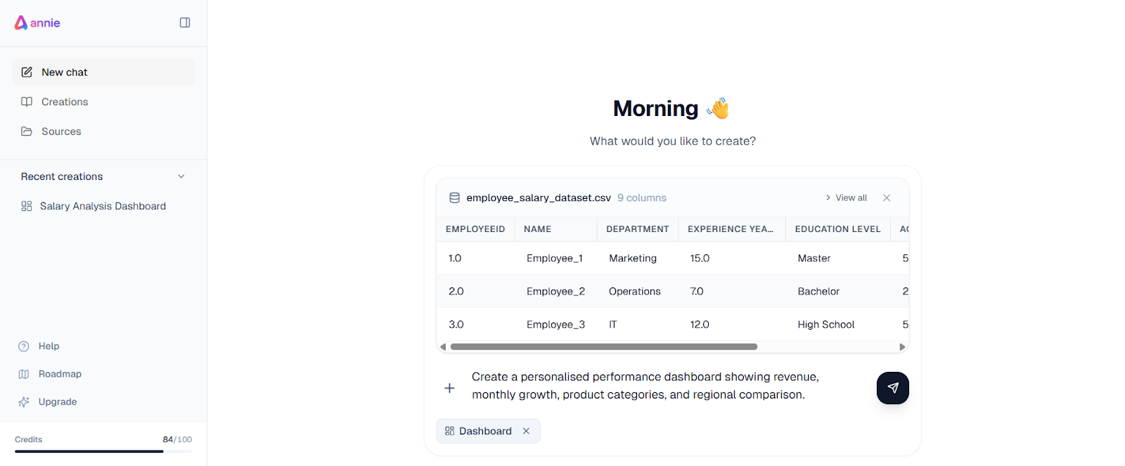
From this prompt, Annie automatically generates the entire dashboard.
What Annie Does Automatically
- Understands the dataset structure and available fields
- Interprets business intent from the request
- Calculates required metrics and growth comparisons
- Selects appropriate visual types for each KPI
- Applies a clear, logical layout
- Generates narrative insights explaining trends and changes
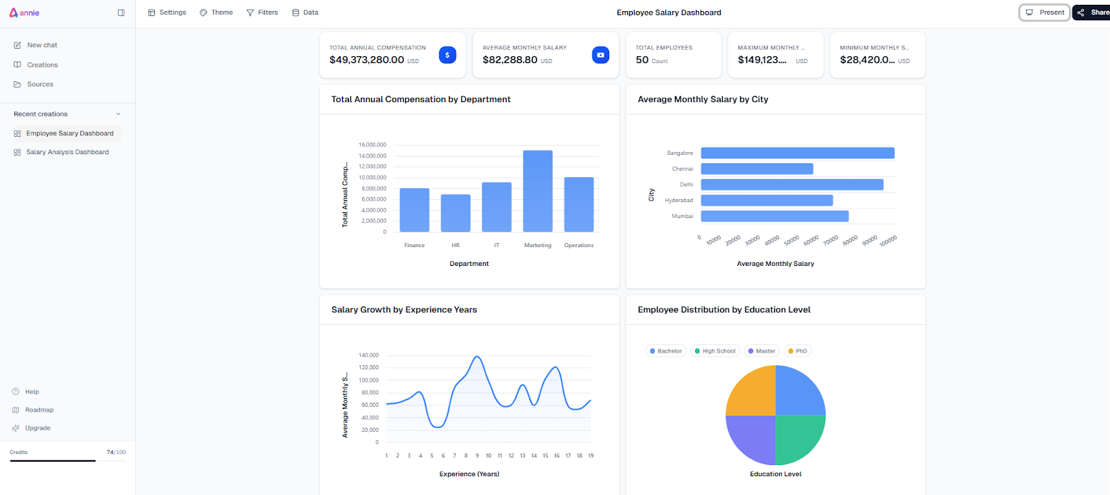
There is no need for manual data modeling, DAX formulas, or visual configuration. The result is a complete dashboard that includes both visuals and written explanations.
Time: Under 30 seconds
Skills required: None
This highlights the core power of Annie: it translates business questions directly into visual and narrative insights without requiring technical intervention.
Speed and Complexity Comparison
To evaluate the tools objectively, the comparison focuses on three dimensions:
- Number of steps required to build the dashboard
- Level of technical skill needed
- Time to complete the process (divided into beginner vs expert)
| Tool | Steps Required | Skills Needed | Time (Beginner) | Time (Expert) |
|---|---|---|---|---|
| Tableau | Multiple manual steps | Advanced | 2-4 hours | 30-60 minutes |
| Power BI | Multiple manual steps | Advanced (DAX) | 2-4 hours | 30-60 minutes |
| Annie | Single instruction | None | Under 30 seconds | Under 30 seconds |
Traditional BI tools prioritise control and flexibility, but they rely on manual execution. Annie prioritises speed and accessibility by automating both dashboard creation and interpretation.
Who Each Tool Works Best For
- Tableau: best suited for analysts who need highly customized, presentation-focused dashboards and full control over visual design. Tableau excels when layout precision, bespoke visuals, and analyst-driven exploration are the top priorities.
PowerBI: ideal for enterprise BI teams that require strong governance, structured data models, and advanced calculations. Power BI performs best in environments where centralized control, standardized metrics, and DAX-based logic are essential.
Annie: designed for business users and fast-moving teams that need answers, not dashboards. Annie removes the traditional BI barrier by translating business questions directly into dashboards and written insights. By combining natural-language interaction, automated reasoning, and narrative explanations, Annie enables teams to understand what’s happening in their data immediately, without relying on technical specialists, predefined models, or manual configuration.
The Shift Toward Faster BI
Each task in traditional dashboard creation adds time and requires technical expertise. As a result, answering a simple business question can take hours instead of minutes. Annie approaches dashboard creation from a different angle. Instead of asking users to build dashboards piece by piece, Annie generates complete dashboards directly from natural-language instructions. By removing manual modeling and configuration work, Annie significantly reduces the time between asking a question and understanding the answer.
Dashboard delays were never caused by a lack of BI capability, but by workflows built around manual modeling, calculation, and layout. As this comparison shows, the real difference between Power BI, Tableau, and Annie lies in how quickly each tool turns a business question into insight.
The fundamental shifts:
- Manual construction → Natural-language generation
- Technical configuration → Automated reasoning
- Delayed reporting → Instant understanding
This shift highlights how modern BI is evolving toward faster, more accessible analytics, where insight arrives at the pace of real decision-making rather than reporting cycles.